| |

|
 |
Introduction |
It is commonplace for archaic terms to remain in daily use, often to the point where present users have no experience of the act they are describing and frequently not knowing from what the expression derives. Other than those who seek to keep historic technology alive and in use, how many people ‘hang up’ their telephones? Or indeed ‘dial’ the number in the first place. There are many other examples. |
Sadly, the reverse is also true when uninformed people use valid expressions they have heard experts use and then trot them out wrongly, and so mislead the listener or reader. It can then take a grip rapidly and spread like a disease. Things can get worse still, where the uninformed then corrupt the words, and the spelling, and we end up with something incomprehensible; so what exactly do computer software writers – and now users of most software – think they mean when they say ‘font size’? |
I detest this phrase. It is another software abomination, where developers either borrow a valid technical term from (in this instance) typography and typesetting, that had been happily in use minding its own business for several centuries and apply it to a different concept, or they invent an expression, such as ‘font size’, to describe something that is simply inappropriate – and indeed literally speaking cannot exist. (Sadly the word ‘literally’ is now in common usage incorrectly too.) |
It started when American software programmers took the word ‘fount’ (pronounced ‘font’) spelt it wrongly, and then with a scatter-gun approach replaced the already existing correct word ‘typeface’ for no good reason. |
But first, what actually is a fount? |
Glossing over hundreds of years of development, all you need to know (for now) is that typesetting used to be done by assembling individual characters, back-to-front, each made out of metal or (for the much larger sizes, wood) from a ‘fount’ of type. Each individual character (known as a ‘sort’) was carefully spaced with extraordinary expertise and made up into pages or whatever. This was not a job for the fainthearted and not a job for the untrained. |
A fount of ‘type’ is an overall quantity of characters of any given size, having differing quantities of letters, numerals and punctuation marks, in proportions worked out by hundreds of years of experience and according to their expected frequency of use for different kinds of jobs. But I might be leaping forward too quickly here and presuming a knowledge of typesetting before computers, or indeed before photosetting (also called filmsetting), the latter of which started to dominate in the early 1970s. |
Therefore, in English, a fount of type would have a greater quantity of lower-case ‘e’ than anything else, and perhaps only a handful of seldom used letters such as a capital ‘Q’ or ‘Z’. Setting large quantities of car registration numbers or postcodes could be a problem if you used standard founts. |
| |
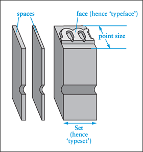 Here is an illustration of what one letter (in this example, a lower case ‘m’) looked like. The back-to-front characters were assembled tightly together to make up ‘lines of text and pages. Ink was applied to the ‘face’ of the letters, after which they were pressed (that’s where the word ‘press’ comes from that describes a printing machine) onto the paper. Here is an illustration of what one letter (in this example, a lower case ‘m’) looked like. The back-to-front characters were assembled tightly together to make up ‘lines of text and pages. Ink was applied to the ‘face’ of the letters, after which they were pressed (that’s where the word ‘press’ comes from that describes a printing machine) onto the paper.
From the illustration it can be seen the blocks of type were tall enough to cope with letters which had ‘descenders’ (‘g’, ‘y’ and others) descending below the base line of the capital letters. It can also be seen that ‘ascenders’ ‘b’, ‘d’ and others) and capitals would fit the body height.
The ‘point size’ is actually measured from a little above the ascenders to just below the descenders. When lines of type were assembled, one above the other, if the character reached the full height of the body it would invite damage to the letterforms.
Different designs, or styles, of lettering had (and still have) different names. This is the derivation of what are now erroneously called ‘fonts’. They are ‘typefaces’ and not founts – and absolutely not ‘fonts’.
|
| |
It is very important to understand that any given fount was only one size of type, so if you needed (say) Garamond in 10-point and also in 16-point, that was two founts. However, founts were designed for different purposes, so a ‘card-fount’ would be quite small in quantity and relative proportion of characters. Just enough type to use for printing a postcard or invitation, for example, hence its name. |
If on the other hand you were setting a book, you wouldn’t buy hundreds of card founts to get enough type; you would buy a ‘book fount’ which would have possibly thousands of lower-case ‘e’, and perhaps 50 each of ‘Q’ and ‘Z’. A book fount might weigh several hundred pounds (weight), a card fount maybe two pounds. |
So, to use the word ‘fount’ no matter how you spell it, when you merely mean a specific ‘typeface’, (the design) is quite wrong. In the real world they are typefaces – and if anyone insists on spelling ‘font’ without the ‘u’ in the middle, then can they be surprised when referred to a place of worship where they will find it near the west door, full of water. |
Therefore however you spell it, ‘font size’ is not appropriate and the correct description is ‘typesize’. Language of course evolves and, purely by happenchance and, not through any great master plan, it might be a useful distinction now to spell ‘fount’ when referring to letterpress typesetting and ‘font’, for computer typesetting. It is demonstrable though that ‘fount’ refers to the quantity of characters bought in one go for one typeface in one point size and absolutely not the design of the typeface. When you use your computer, you are choosing a typeface and not a ‘font’. These were stored and used, from two ‘cases’. |
| |
 |
Just as today, computer users can buy ‘fonts’ from different suppliers. In the days of metal and wood type it was common that different typefounders (hence ‘fount’) would often have typefaces only available from them. For example: one of the twentieth century’s most used typefaces, Gill Sans, was from the Monotype company.
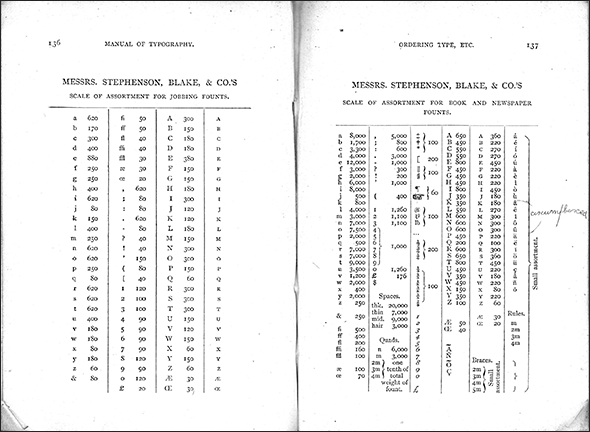
Above is one page from a catalogue from another company, Stephenson Blake, and it can be seen, just from this double page, the variety of quantities of individual characters that would be received when you ordered from them.
As well as all the letters, numerals and punctuation marks, you would of course also need different thicknesses of ‘leading’. The strips of lead were used for vertical spacing of consecutive lines of type on the page. |
| |
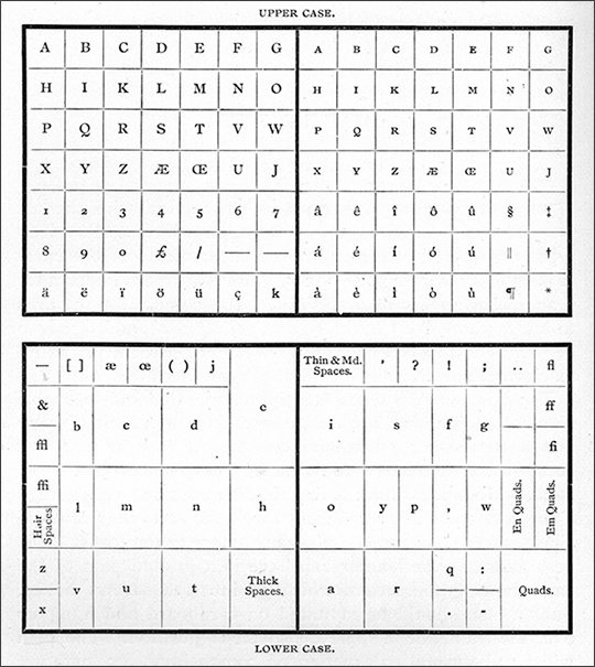 |
There were many different configurations of type cases, but that’s another topic for another day. This particular one shows the Upper Case also containing ‘small caps’. The latter were for use when word(s) in continuous text or titles were all in capitals, such as an acronym like QUANGO. As you can see here, it stands out too much on the page and would be wrong set as ‘Quango’. Small caps retain the capitalizing but reduce the visual impact to narrative lower case text, as in QUANGO.
Note: most computer programme software and typefaces can’t do ‘small caps’ properly – all they do is reduce the point size (as above), which of course makes the letterforms too thin. Properly designed small caps have the characteristic height of lower case letters without descenders (this is known as the ‘x-height’) but with the correct stroke thicknesses to match. |
| |
 |
Reproduction of a page from a contemporary book making clear, I hope, what an ‘upper case’ and a ‘lower case’ looked like. |
| |
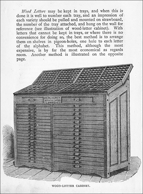 |
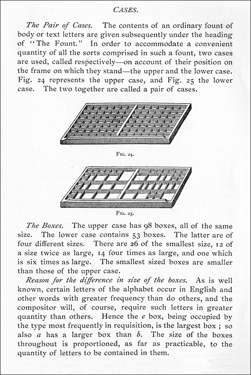
The illustration shows what a type cabinet looked like and, again, there were many different designs. The one thing that was consistent was that any given ‘fount’ had two trays stored together, with the ‘upper case’ always above the ‘lower case’ in their allotted position in the cabinet. When in use, the lower case was on top at the front and the upper case behind and above it.
(Yes, it took up a lot of room and the floor had to be extraordinarily strong.) |
| |
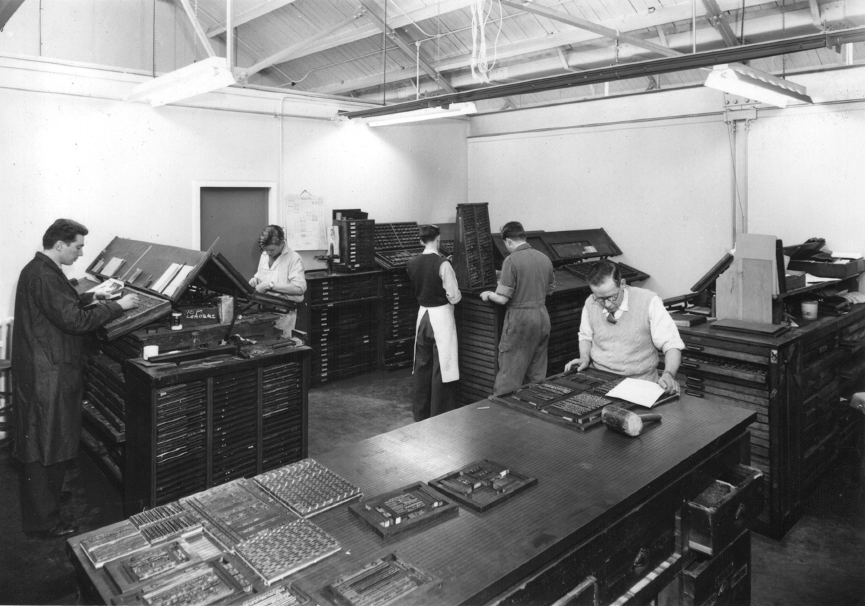 |
A fairly typical ‘comp room’ (compositors’ room) showing various type cabinets and other equipment. To the left a typesetter is selecting individual metal characters, known as ‘sorts’, from a type tray. The man in the foreground on the right is making up pages of ‘standing type’ ready for inking up and ‘letterpress printing’ |
| |
And there are only two cases |
To round off, in typesetting there are just two cases, an ‘upper case’ and a ‘lower case’. As explained above, these are historic descriptions of the wooden sub-divided cases in which each of the accumulated quantities of each individual character, of one fount, were kept and withdrawn from to make up typeset pages. I repeat, for each typeface there was an ‘upper case’ containing all the capital letters, used mainly at the beginning of sentences (and with a single word-space between it and the preceding full stop), and the ‘lower case’ all the other (small) letters, together with punctuation marks and so on. There were a pair of these cases for every typeface in every size. |
The expression ‘upper case’ and ‘lower case’ describes the relative position of each kind of case of ‘type’ on the stand or composing cabinet at which the ‘compositor’ stood when working. Two cases of type is all that can be comfortably worked at, though sometimes the ‘comp’ (short for ‘compositor’) had to leave his position in order to find a special ‘sort’. |
Where has this latest nonsense of title case come from? |
Historically, the terms ‘upper case’ and ‘lower case’ actually refer to the typecases containing the type, and not to the type itself. |
There is no need to invent the concept of a third case ‘title case’, in any event is utter nonsense, since titles are best set in small-caps (with the appropriate letter-spacing, of course), or a ‘titling’ fount if held in the shop. (A titling fount is where there are only capital letters, cast on the full body of the type size concerned, so, because there is no lower-case type, you don’t need to cater for the descenders – but we are now drifting into greater detail than appropriate for a short and very generalized article such as this one.) |
If your design requires setting the titles in ‘Upper- and Lower-case’ type, with a capital letter for each initial, it is simply described as ‘setting in Upper- and Lower-’, or ‘U/L/C’ for brevity), if there is any fear of misunderstanding, you can specify the setting to have ‘cap initials’ on every word. This is poor design practice, and leads to such dilemmas as whether to set some words, for example, ‘the’ or ‘a’ in caps or lower-case. |
And we haven’t even thought about the design of typefaces themselves. This is another area of massive misunderstanding, so much so that like most things that amateurs do with their computers, it is all thought to be easy. The only thing easy about type design and its use is to assume there is not much to it. |
| |
| February 2017 |
| |
 |
| |
| * * * |
|
| |
|
|