 |
 |
| An important memorial to Edward Johnston was unveiled on a walkway at Farringdon station on 24th June 2019 and I was delighted to be invited by Edward’s grandson, Andrew. |
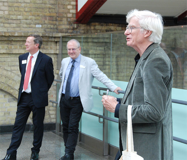 |
| Before the unveiling, Andrew Johnston delivered a short speech giving some historical context to what emerged in 1916 and how billions of passengers have benefited – oh, and so too have the operators of their bus and rail services it explains. In the background, to the left is Brian Woodhead (Director of Customer Services TfL) and centre, Sir Peter Hendy (Chairman of Network Rail and previously Commissioner for Transport TfL). |
|
| Visitors to this website will know how highly I regard the work of Edward Johnston and his display letterforms commissioned by London Transport’s significant predecessor, the Underground Electric Railways Company of London. |
| Recognising how much of a muddle the railway’s signage and posters were, Johnston was asked to design a clear and legible type. Today we would call the result a ‘corporate lettering’ but at that time it was a pragmatic solution to an identified problem that was sought, and achieved, not a marketing tool. |
| Johnston’s new typeface started to be used for posters in 1916. It should be understood that it was not intended to be used smaller than 36pt and it was for this application that Johnston designed his letterforms. Sadly it was, and still is, widely misused, much smaller, where it is quite unsuited – but then Johnston knew that and that wasn’t what it was designed for. |
| Most readers younger than about thirty years of age may not be aware of how the majority of typesetting was done before computers. Words were assembled from individual back-to-front characters made of metal. Metal type for Johnston was only made in 36pt, 48pt and 60pt with larger sizes only in wood. As can be imagined, a poster, even one with only a dozen or so words in large sizes, would be very heavy to print from. As such, in the larger sizes the characters were made from wood. The trade called it ‘woodletter’. For practical purposes 72pt is the same as one inch in height. Sizes greater than this were not described in points but in ‘lines’ – with 72pt being ‘6-line’, as 12pt was regarded as 1-line for historical reasons I cannot go into here. Therefore ‘7-line’ would be what is now regarded as 84pt, ‘8-line’ as 96pt and so on. Intermediate sizes were not needed as posters don’t require such small gradations in size. |
It is also important to understand that Johnston’s letterforms were not made for printing in either wood or metal until many years after its introduction. The letterforms were used as a guide only, for poster artists who hand-lettered them. Looking at the majority of the output of this period clearly shows how easy it is to take something extremely well suited to its intended purpose, and have most of its qualities ruined by users who do not have the understanding or skills required. (Sadly, this is even more true nowadays.) When eventually cut in wood and cast as metal, the genuine skills of the cutters rectified much of this, though their own skills in understanding of how ink reacts when pressed onto paper, caused some small adjustments to the original letterforms to deal with this phenomena. On close inspection, the wood and metal types show necessary variations from each other as well. |
| The display at Farringdon station can be regarded as a sort of woodletter sculpture in tribute to this fine typeface and Edward Johnston’s remarkable insight into what would achieve what his client needed. |
| ‘Heritage’ is a buzzword I dislike – we can ‘inherit’ the good, the bad and the indifferent. Not all things are worthy of respect just because they are old. I am not one to stand back and admire Johnston’s work just because it is old, but because of its enduring power to work so very well when used as intended. |
| I am so pleased to have as friends, kindred spirits such industry heavyweights Sir Peter Hendy CBE and Leon Daniels OBE, both of whom truly understand the importance of Edward Johnston’s fine types and the importance of clear, legible, messages it effortlessly conveys to literally millions of passengers every day. Edward’s grandson Andrew Johnston is also doing fine work in championing his grandfather’s work and keeping it in the public domain, though in truth this should not be necessary. In my world it speaks for itself. |
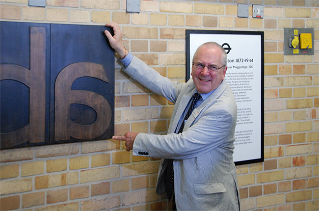 |
| In having been asked to unveil the woodletter sculpture, the pleasure on Sir Peter Hendy’s face is clear and a joy to behold. It was a bit of a surprise that neither Sir Peter’s successor, nor any of the latter’s senior Managing Directors, were present - perhaps they didn’t know. |
|
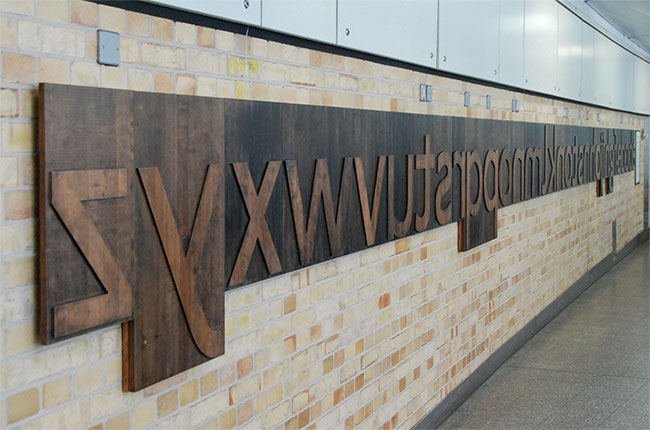 |
| The complete display seen from ‘z’ to ‘a’ and incorporating Johnston’s name interrupting the sequence. Typesetting of this sort required the characters to be back-to-front. Just to be clear how metal and wooden letters worked, their raised areas forming the letterforms would have had ink applied with a roller and the assembled characters then pressed (hence the term ‘letterpress’ printing) onto the paper. The sculpture is of course many many times bigger than any real type that would have been used on real printing jobs. |
|
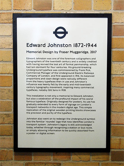
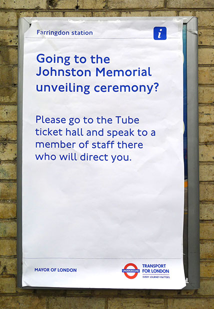
At the right-hand end of the sculpture a poster gives some explanation as to what is on display.
|
|
 |
|
My own small contribution to this is the evolved designs of four Johnston type variants seen now on more and more of TfL’s buses. I am very proud of this:
Londons bus destination blind displays > |
Below is a transcript of the speech delivered by Andrew Johnston on the day |
Firstly I would like to thank Brian Woodhead of Transport for London and Sir Peter Hendy of Network Rail for their kind words and their enthusiastic support for this project. When Transport Commissioner for London, Sir Peter did much to ensure the survival of my grandfather’s type and I wonder how many other senior managers in the business of transport would know (or care) about the exact shape of a number 4! |
This is a very special occasion for our family and it’s nice to have three generations present. Our gratitude goes to all who have helped to create this memorial to my grandfather and his type. Working backwards, special thanks go firstly to Gareth Leslie and his team for their energy and commitment. They have breathed new life into the project and brought it to a successful conclusion. Printer Thomas Mayo and manufacturer Domenic Ash have done a wonderful job producing the beautiful wooden printing blocks that form the memorial. They were following an impressive and highly original design by Fraser Muggeridge, and we’re very glad that the man who dreamed up the whole idea in the first place is here today, former Head of Heritage at TfL Mike Ashworth. So our warmest congratulations go to all of them. We should also pay tribute to Frank Pick, the visionary who first gave London’s transport system its identity, and to TfL for continuing his tradition of good design and for funding this memorial. |
Just over 100 years ago, Pick decided that he wanted to improve the quality of the lettering used for posters on the Underground. He wanted something that would draw on the best elements of previous types, while looking unmistakably modern. Edward Johnston was a most unlikely choice to be its creator, being neither a typographer nor a graphic designer, but a self-taught scribe who had single-handedly pioneered a revival of the lost art of formal penmanship. |
He was recommended by his friend Gerard Meynall – a printer who was known and trusted by Pick. He admired Johnston’s calligraphy, but also understood his love of science, which included snipping-up tobacco tins and soldering them together into various electrical gadgets. We have a postcard from Meynall to my grandfather which says ‘dear sir, I am sending you two sardine tins, please make me a telescope and a motor bicycle.’ So he may have seen Johnston as someone who could relate to a modern electric railway system, while still drawing inspiration from the past as Pick had specified. |
Using his skill as a calligrapher and basing the proportions of the letters on classical Roman examples, Johnston delivered his type design in 1916. He dispensed with serifs, the decorative features at the top and bottom of traditional lettering, to produce a clean ‘sans serif’ alphabet. This was not exactly revolutionary – similar ‘block’ letters were already widely used on the Underground, but Johnston’s alphabet was much easier to read, being better proportioned, better spaced and far more handsome than previous examples. With human touches like the jaunty calligraphic diamond dots on the letters i & j, it has a quality which encourages the passenger to trust the information it’s giving. It conveys authority, but without feeling authoritarian and has been called ‘London’s handwriting’. This seems entirely appropriate as Johnston was always first and foremost a scribe in the Medieval tradition. |
Pick soon saw that the new type could also be used for general signage, including station names. He gave Johnston the task of re-designing the solid red ‘bullseye’ logo into the familiar ring and bar ‘roundel’, on which his lettering was carefully positioned for maximum readability. Thanks to Mike Ashworth’s preservation of a few samples of the original design, it’s still possible to compare both versions on the District Line platforms at Ealing Broadway [initiated by the then District Line General Manager, Nick Agnew – DR]. |
When Henry Beck produced his iconic system map in the 1930s, Pick had a world-class branding that clearly identified his transport system to its users and instantly said ‘London’ to the outside world. To appreciate the difference, try finding a New York subway station! It’s a source of much family pride that two of the three key ingredients of that branding were created by my grandfather. The ‘corporate image’ developed by Pick became the example for other organisations to follow and it’s no exaggeration to say that its influence has been global. |
Johnston later developed a compressed type for use on bus destination indicators. It was less elegant than his original version, but offered a practical solution to the problem of conveying clearly a lot of information in a confined space. In a rare example of personal pride he told his calligraphy students that, thanks to his lettering, they could now tell where a bus was going, adding ‘your parents never knew’. Early photographs of horse buses show what he meant as they all seem to be going to Pears Soap, Fry’s Cocoa or Coleman’s Mustard! Today, thanks largely to Sir Peter’s insistence on proper destination blinds rather than the much cruder dot-matrix displays, we can still see clearly where a bus is going. |
It wasn’t all plain sailing however. Most of the type was only available as wood blocks [in metal for the smaller sizes – DR], which limited its use, and by the 1970s there were moves to abandon it altogether. Fortunately its life was saved by the introduction of a wide range of weights and sizes suitable for modern type setting and known as ‘New Johnston’. It was created by the Japanese designer Eiichi Kono, who we are very glad to have with us today. Finally, as Sir Peter has explained, its centenary was marked by the introduction of ‘Johnston 100’, which restored some original features and further ensured its survival. |
So today we are celebrating the durability and the influence of a design inspired by Frank Pick’s vision and created by Edward Johnston’s talent, and we’re doing so with a wonderful and lasting memorial of which I’m certain both men would have been very proud. To help mark the occasion, the Edward Johnston Foundation is producing a book, which will soon be available, on the Underground type and the lasting legacy of its unlikely creator. |
Postscript |
|
Bearing all this in mind, it would appear there are still many who don’t quite get it.
|
|
 |
| |